Monday, May 31, 2010

Best Ideas for week June 1 2010


After over 300 charts here are the best ideas in no particular order:

MEE: At top of descending channel if gets through 33.50 can make 38.44 and 200SMA


MMM: Range between 100/200SMA. If 200SMA fails look for 70.51


MA: Looks to test support at the 195ish area again. Failure there brings 190 and 180 into play


RY: Sorry all you Canadians, this looks to be going to test 48.70. Bounce there is a buy, supp below is 45


STT: 35.35 coming


AOL: This looks horrible. Consolidating after a $5 drop getting ready for the next $5 down.


SHLD: Needs to close 89.50 - 90 to reverse and try 102 otherwise support at 86.56, then 77.


BIDU: Back on track going to 100


SNDK: Broke 5 yr resistance, consolidating before more. Could see 50 soon.


VMW: Next test is 72.87 from May - June 08


Trade em well!!

The Importance of Using Multiple Timeframes

Most Technical Analysts have a timeframe that they use to trade or invest. A day trader may use a 1 minute or 5 minute chart to capture short term nuances in a stock price fluctuation. A swing trader might use a 30 or 60 minute chart to avoid some of the extreme short term noise. Position traders might use a 1 day chart to see intermediate trends and a long term investor might like to look at weekly or monthly chart to see a stronger trend.

As each type of trader/investor ponders their own 'standard' chart there are different ideas and patterns that more visibly present themselves, sometimes masking or overwhelming other important patterns. Each timeframe gives different moving average figures and momentum indicators. Let me walk through an example using the 5 minute, 60 minute, daily, weekly and monthly charts for SPY the S&P 500 ETF.

5 minute chart


On the 5 minute chart there is support at the 109 level and the recent uptrend line. All SMAs are neutral. Points to a short term positive if trend holds.

60 minute chart


The 60 minute chart defines support at 108.78 at the 50hr SMA with further support at the bottom of previous channel. It shows resistance at 2 levels, the channel from a few days ago and the recent high of 110.76 followed by the 100hr SMA at the same level of the triple doji before the gap down. more positive then negative but in a range.

Daily chart


The daily chart reveals a test of the LT downtrend (resistance) line right at the 200 day SMA on weaker volume. More bearish than bullish until pierces the 200SMA

Weekly chart


The weekly shows a stepping down since the beginning of April and a probe of 104.75 three times, forming the base of a descending triangle. Last week was a near hammer candle though. Here a break of the downtrend or the 104.75 support defines direction.

Monthly chart

The monthly chart shows the April shooting star correctly predicted the sell off in May. Price has now tested below but held a 50% retrace of the March 09 - April 10 up move. Support now is the 50% retracement at 108.60. A very bearish candle for May.

So you can see that although in many of these different timeframes support is in a tight range, the shorter term charts arte much more bullish than the long term charts.

Putting money to work using just one chart is like driving a car and looking out the windshield but not using the rearview or side mirrors. You get a lot of information but not all of it. I am not advocating that you have 5 different timeframes running as you trade your book. But you can gain an edge by knowing at 3:00pm on Friday or an hour before the close on the last day of the month, the stock you are watching is near a critical level for that timeframe, even if it does not seem to be in the shorter timeframe that you are trading.

Tuesday, May 25, 2010

The case for shorting EL...still

Estee Lauder Cos, ticker EL, got on my radar February 19 as a potential short. At that time it was still 58.83 and on the way up. RSI was very strong in mid 80s and the MACD indicator looked ready to cross and rollover. A month later at nearly 64 it only looked juicier. Late April I started nibbling via May 55 puts when the stock hit 68 only to have them expire worthless, when it popped again after the flash crash. Monday I got short again via July 55 puts, despite the stock being well off its highs. Here is why I am so adamant of a breakdown:


1. From the chart you can see that every time over the 15 year life of the stock when the MACD has crossed and rolled, and the RSI peaked and rolled, the price has retraced at least 61.8% of the previous up move. This has happened 5 times.
2. Retracement to the 61.8% area from last up move would now take the stock to near the 100day and 200day SMAs.


Although it has dropped from 70 to 57.57 and many think they have missed the short boat, I believe there is potentially still another $17 to be made.

Sunday, May 23, 2010

Charts Still Do and Have Always Mattered

April 27 was the key day and was confirmed on April 30th. That was the day the technicals started to roll over on the indices. The weekend of May 1&2 I started posting support levels for the SPX, SPY, QQQQ and IWM. There were still a lot of long set ups within the financials, tech and retail. Pharma and commodity related stocks were getting toppy with a bunch of great shorts. I, along with everyone else, was calling for new highs for GLD and GC_F and a run for the dollar. Then came the 'flash crash' May 6th. The speed of the fall was as incredible as how fast it stopped and reversed. Following that day there were pundits and 'professionals' on the boob tube, as well as educated professional traders and self proclaimed part-time technicians on social networks (like Stocktwits, my preference) stating that in this environment that the charts do not matter anymore. To that I call bullshit!

It is not surprising that this would occur. In any world disaster afflicted people question their religion, in government induced disasters they question the President and Legislature. I do not put the flash crash into these categories but I think it helps make the point. But come on, it makes no sense to give up on the technicals just because the market moved a lot. First, a good technician knows that technical analysis give you an edge, but is not a guarantee of where a stock price is moving. Second, the basis of technical analysis is that all information is included in the price. Finally, much of the history and following of technical analysis is based its applicability during a crisis.

But this blog is supposed to be about charts so how about some proof.


Notice the notes detail a fall totally undeterred or directed by May 6 alone


Again the chart tells a tale of decline


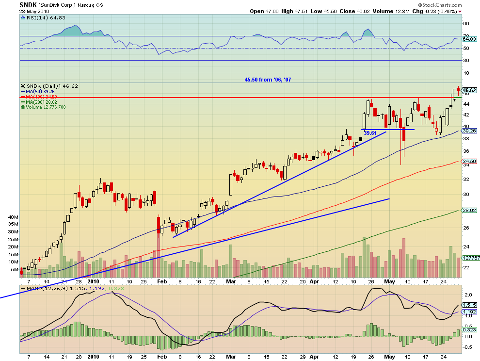
Here the story started in late April and went undeterred by the flash crash.

I will need to start saving more historical charts to have more variety to show going forward, but you get the picture. Charts did not break down and continued to provide an edge in the volatile events of the last 3 weeks. Believe!

IDEAS FOR THE WEEK

ATW, CLF, DRYS, RIG as shorts, if Friday reversal does not hold. JPM, MA, MS long, if Friday was not a fake out and continues, and EL, GOOG & RIMM short irregardless. All charts and targets have been posted to chart.ly under @harmongreg